The incomplete history of Design Tokens
A thirty-year story about a single idea: that design decisions should be named, shared, and separated from the things they style — from Håkon Wium Lie's 1994 proposal to the W3C specification.
This week I sat down to prepare a 10 minute presentation on design tokens. My goal was to help align designers and developers on what tokens are, why they matter, and how to use them.
In doing so, it took me back. As one of the co-founders of SydCSS, I was in the community during the years when OOCSS, BEM, Sass, and Atomic Design were the conversations happening at meetups around the world. Preparing this talk made me remember that time, and all the important steps that were taken to get us to where we are today. I should be upfront that I am a web person, and that's the lens I'm bringing to this.
What I found, when I laid it all out, wasn't just a history of design tokens. It was a thirty year story about a single idea — that design decisions should be named, shared, and separated from the things they style — being passed from person to person, each one taking it one step further than the last.
Here's all the things I remember leading to this moment.
In the beginning
In October 1994, a Norwegian web pioneer named Håkon Wium Lie was working alongside Tim Berners-Lee at CERN when he published a proposal. He called it "Cascading HTML Style Sheets." The core idea: separate the content of a web page from its presentation. Stop tangling the two together. Let structure be structure, and let style be style.
Two years later, in December 1996, that proposal became CSS Level 1, the first official W3C recommendation. Font properties, colours, text alignment, spacing, borders. It established a principle that would shape the next thirty years of web development.
The problem was that for years, almost nobody used it properly. Browsers implemented it inconsistently, designers didn't trust it, and most of the web continued to be built with tables and inline styles. The separation of concerns that Lie had proposed remained more of an ideal than a reality.
That changed in May 2003, when a Canadian designer named Dave Shea launched CSS Zen Garden. The idea was simple: one HTML file, unchanged. Hundreds of different designs, all achieved through CSS alone. It proved that Lie's original idea worked. Structure and style could be completely separated. The same content could look like anything.
For those of us in the web community at the time, CSS Zen Garden showed us what CSS could do and it changed how we thought about what we were building.
The community starts to think in systems
CSS Zen Garden had proven the principle. But proof of concept and practical reality are two different things. As websites grew more complex, as teams grew larger, and as the same patterns kept appearing across page after page, a new problem emerged. CSS itself had no real structure. It scaled badly. It became tangled, repetitive, and difficult to maintain. The cascade, for all its elegance, could quickly become a nightmare.
The community responded by doing what communities do — it started sharing solutions.
In 2006, Hampton Catlin and Natalie Weizenbaum released Sass. There were other CSS preprocessors emerging around the same time, but Sass was the one that stuck. For the first time developers had a preprocessor that went mainstream, bringing variables, nesting, and reuse into the everyday stylesheet workflow. You could write $brand-blue once and use it everywhere. It was a single source of truth, but one that lived only within your stylesheet, and only on the web. It couldn't travel anywhere else.
Three years later, in 2009, Nicole Sullivan stood up at Web Directions North and presented something she called Object Oriented CSS — OOCSS. Where Sass had given us a way to store values, Sullivan gave us a way to think about CSS as reusable, composable patterns. Separate structure from skin. Separate container from content. It was the first time someone had tried to bring systematic thinking to CSS at scale.
Around the same time, the engineering team at Yandex had been developing their own answer to the same question. They called it BEM — Block Element Modifier. Where OOCSS gave you principles, BEM gave you a naming convention. A shared language baked directly into your class names. It was open-sourced in 2010 and spread quickly through the community.
Jonathan Snook formalised things further in 2011 with SMACSS — Scalable and Modular Architecture for CSS. The first serious attempt to organise CSS at a project-wide level, categorising rules by purpose rather than by page or component. Not just how to write CSS, but how to structure it across an entire codebase.
Then in 2013, Brad Frost brought it all together with Atomic Design. Borrowing from chemistry, he proposed thinking about interfaces as a hierarchy — atoms, molecules, organisms, templates, pages. It gave the industry a shared mental model for building design systems, and it was the moment the phrase "design system" started to mean something concrete rather than just aspirational. It was also around this time that Fiona Chan and I co-founded SydCSS — a meetup for designers and developers in Sydney who cared deeply about the craft of building for the web. The conversations Frost, Sullivan, and others were sparking globally were exactly the kinds of things we wanted to create a local space for.
What strikes me looking back at this period is how much of it happened in the open. Talks at conferences. Blog posts. GitHub repositories. These weren't products — they were ideas, shared freely, built upon by whoever found them useful. Each one was a response to the friction left by what came before.
Tokens arrive
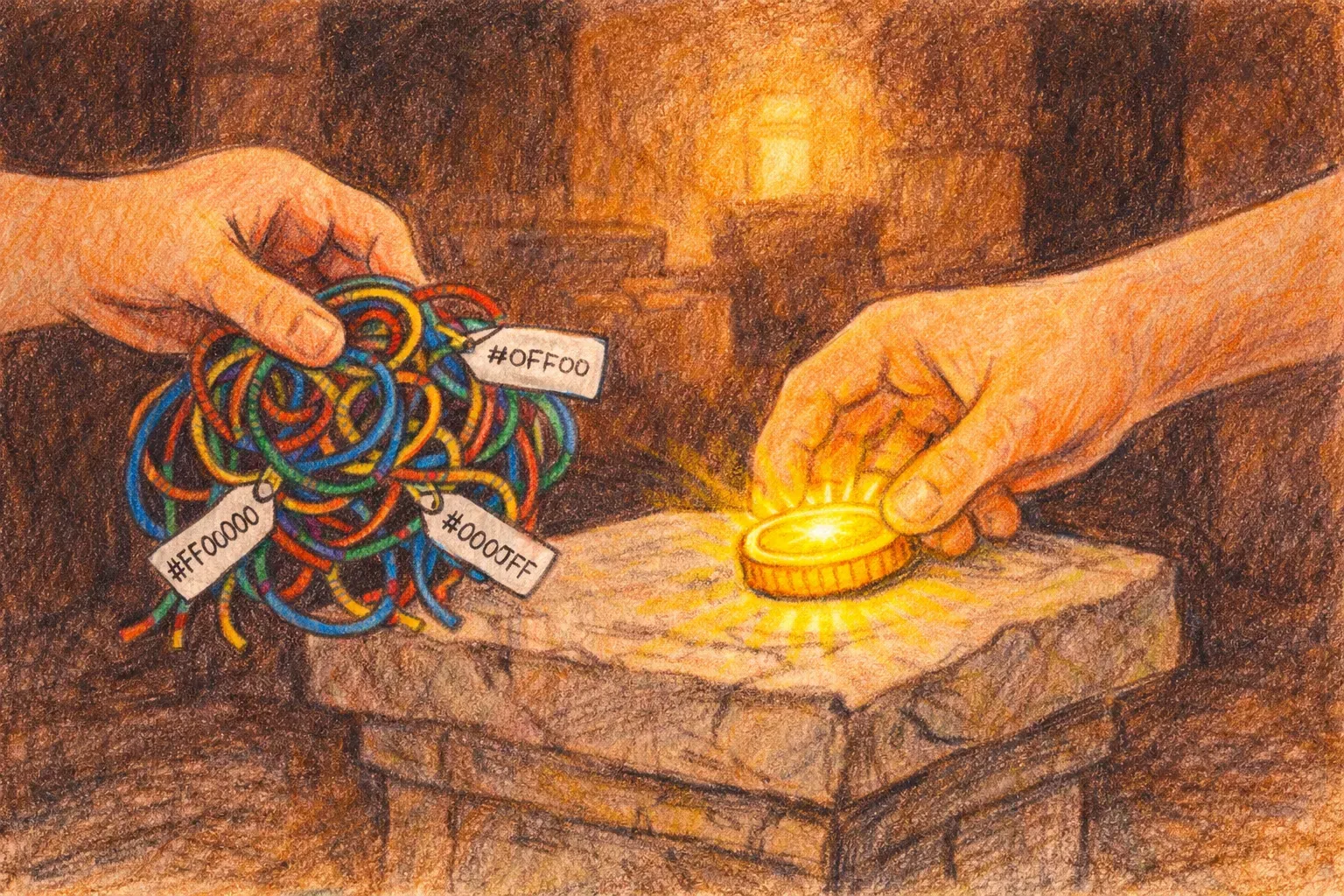
By 2014, the web community had come a long way. We had preprocessors that let us name our values, methodologies that let us organise our styles, and mental models that let us think about interfaces as systems. But there was still a fundamental problem. Everything we had built was platform specific. Sass variables lived in Sass. BEM class names lived in CSS. None of it could talk to iOS. None of it could talk to Android. As products grew across platforms, design decisions were being made once and then recreated manually, in isolation, by different teams working in different languages. The same blue in five different codebases, slowly drifting apart.
Jina Anne was working on the Salesforce Lightning Design System in 2014 when they identified this problem and gave it a solution. They called them design tokens — named variables that could store a design decision once and distribute it anywhere. Not just to a CSS file, but to iOS, Android, Java, PHP, whatever a platform needed. The token itself was platform agnostic. The value could be transformed into whatever format was required.
As Jina put it: "Design tokens are a methodology. Saying 'design tokens are just variables' is like saying 'responsive design is just media queries'."
For a few years the idea remained largely within the walls of Salesforce, powered by an internal tool called Theo. The broader community was aware of it, but the tooling to make it practical for everyone didn't yet exist.
That changed in 2015, when the W3C shipped CSS Custom Properties — native variables in the browser. Unlike Sass variables, they were live. They could be changed at runtime. Theming and dark mode became natively possible for the first time. The web platform had independently arrived at a similar conclusion to tokens — that values should be named, centralised, and reusable — at almost exactly the same moment.
Then in 2017, two things happened that brought tokens to a much wider audience. Nathan Curtis, founder of EightShapes, published "Tokens in Design Systems" — an article that gave the community a shared vocabulary for thinking about tokens systematically, and introduced the idea of options and decisions that would later become the primitive and semantic layers most teams use today. And Danny Banks at Amazon open-sourced Style Dictionary — a build system that could take your tokens and transform them into whatever format any platform needed. For the first time, teams outside of Salesforce had a practical, production-ready tool for working with tokens at scale.
By 2019, enough people were feeling the same friction — every team solving the same problem in slightly different ways, with incompatible formats and no shared standard — that Kaelig Deloumeau-Prigent decided to do something about it. He founded the Design Tokens Community Group under the W3C, bringing together designers, developers, and tool makers to work towards a shared specification. It was the moment the community stopped solving the problem individually and started solving it together.
Going mainstream
The world wasn't waiting for a formal standard. The industry was moving towards tokens whether one existed or not, driven by the growing complexity of multi-platform products and the rising expectations of design teams who wanted their decisions to mean something beyond a single screen.
In 2023, Figma shipped Variables. For many designers, this was their first real encounter with the token model — primitive values, semantic references, modes for theming and dark mode, all inside the tool they used every day. When the most widely used design tool in the world bakes a concept into its core feature set, that concept has gone mainstream. Tokens were becoming an expected part of how design worked.
In October 2025, the Design Tokens Community Group published the first stable version of the Design Tokens Specification. A vendor-neutral, production-ready standard for how tokens should be defined and exchanged across tools and platforms. As Kaelig Deloumeau-Prigent put it: "The specification unlocks interoperability across design tools and code. Design systems teams can now maintain one source of truth that works everywhere — from design to production code across iOS, Android, and web."
Håkon Wium Lie proposed separating content from presentation in 1994 at CERN. Thirty years later, the W3C published a standard for sharing design decisions across every platform on earth. The idea had simply kept travelling, from person to person, each one taking it one step further than the last.
What comes next
The stable specification published in 2025 is a new foundation which is the beginning of the next chapter. The design tokens community is already working through questions that the first version of the spec couldn't fully answer. How do tokens handle complex theming across nested contexts? How do they scale across the growing diversity of platforms? How do AI-driven design tools fit into a token-based workflow? How do we govern tokens across large organisations where many teams have competing needs?
These are hard problems, and they won't be solved by any single person or any single company. They'll be solved the same way everything in this story was solved — by people sharing openly, building on each other's work, and pushing the idea one step further than it had gone before.
That's what excites me most about where this is heading. The history of design tokens is a history of community. And the community is still very much at work.